The project
Guitarpedia is a Brazilian learning platform to teach people how to play guitar. It was created in 2015, and I was involved with the conception of this product.
Kickstarting
The kickstart for this project was to design one research that helped me to understand better the user expectation when they are searching for guitar classes. I asked not only about online lessons but learning guitar in general. The research helped me to identify elements that I could use to engage potential users and also the tone of voice of the product.
The owners of the project did a benchmarking study. This study helped us to figure out what other music platforms have in common, different features, and business models.
User goals and pain points
The main target of Guitarpedia is the Brazilian market. And I learned by the research that language was a pain point for Portuguese speaking people that want to learn music online. Most of the other websites were in English, and this could be a blocker for new customers. We could use the fact that Guitarpedia is a platform made by Brazilians teachers with classes in Portuguese as a good selling point.
There are a lot of videos teaching people how to play guitar for free. Why would people pay for Guitarpedia? One identified problem for the users was the fact that most online streaming services are not optimized for learning music.
Some things that are really important for people that want to learn how to play guitar are hard to do on popular video streaming services.
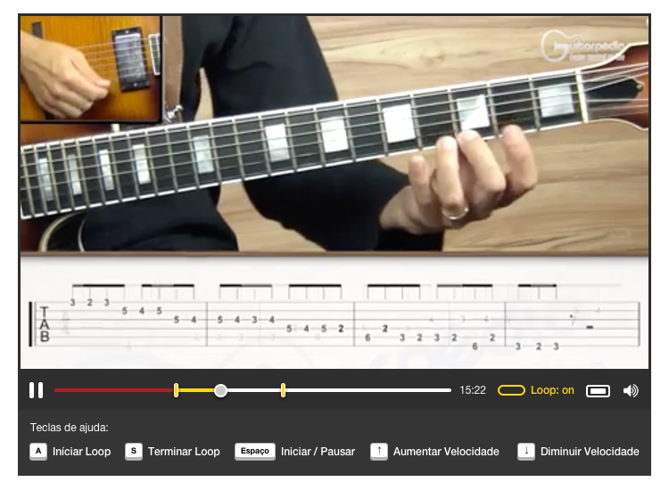
One crucial part of the creation of Guitarpedia was to make a player that helps users to loop just small parts of the video, stop and play, slow down, speed up. These interactions look simple, but in Guitarpedia's scenario, the user is doing this with a guitar on their hands.
Dealing with constraints
Since Guitarpedia was in the early stage as a company, the budget was limited for the project. The number of developers was limited as well, so I should prioritize everything correctly to avoid spending resources.
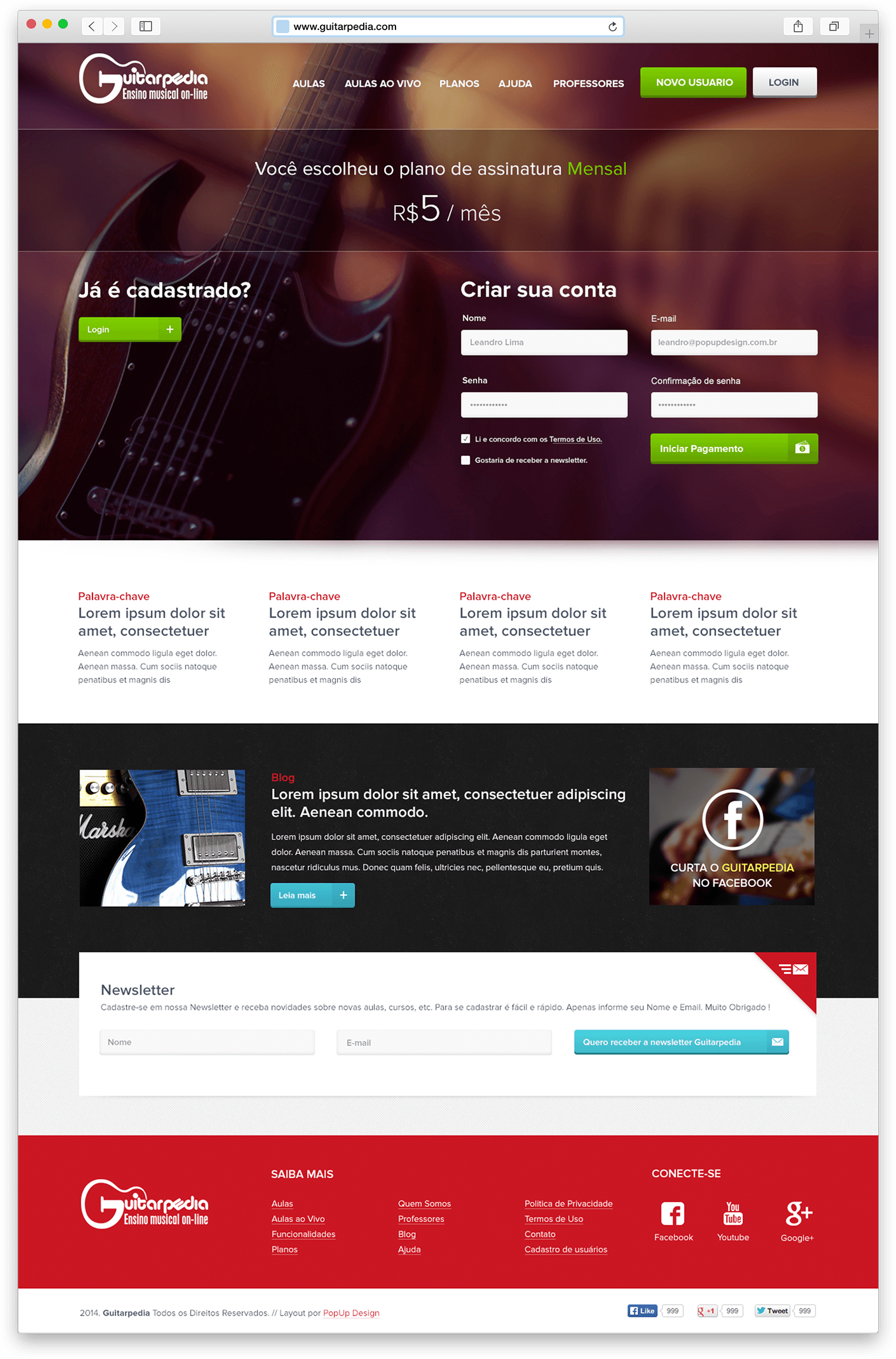
I decided to prioritize the video player because it is the main interaction point of the product. I also gave extra attention to the flow to acquire new students because it's crucial for the business model.
The learning screen
Here was where the student will watch the lessons, practice, see the material, download base tracks.
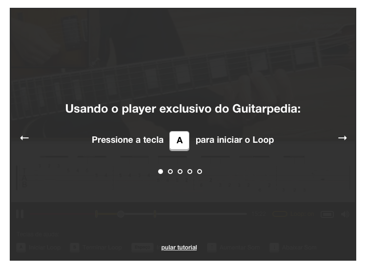
The video player had some special shortcuts, so the user can reach them when they are playing and watching the lessons. They can use these shortcuts to create a loop inside the video, control the volume, the velocity. I highlighted these interactions in the UI. I also did an onboarding for first-time users, so they can learn how to use the player correctly.
Since the user will have one guitar on their hands, I choose by the computer's keyboard as the primary way to interact with the player. The precision with the mouse will be reduced because the Guitar could limit some movements with the arms. Pressing one key in the keyboard is simple than selecting something with the mouse.
Interface Design
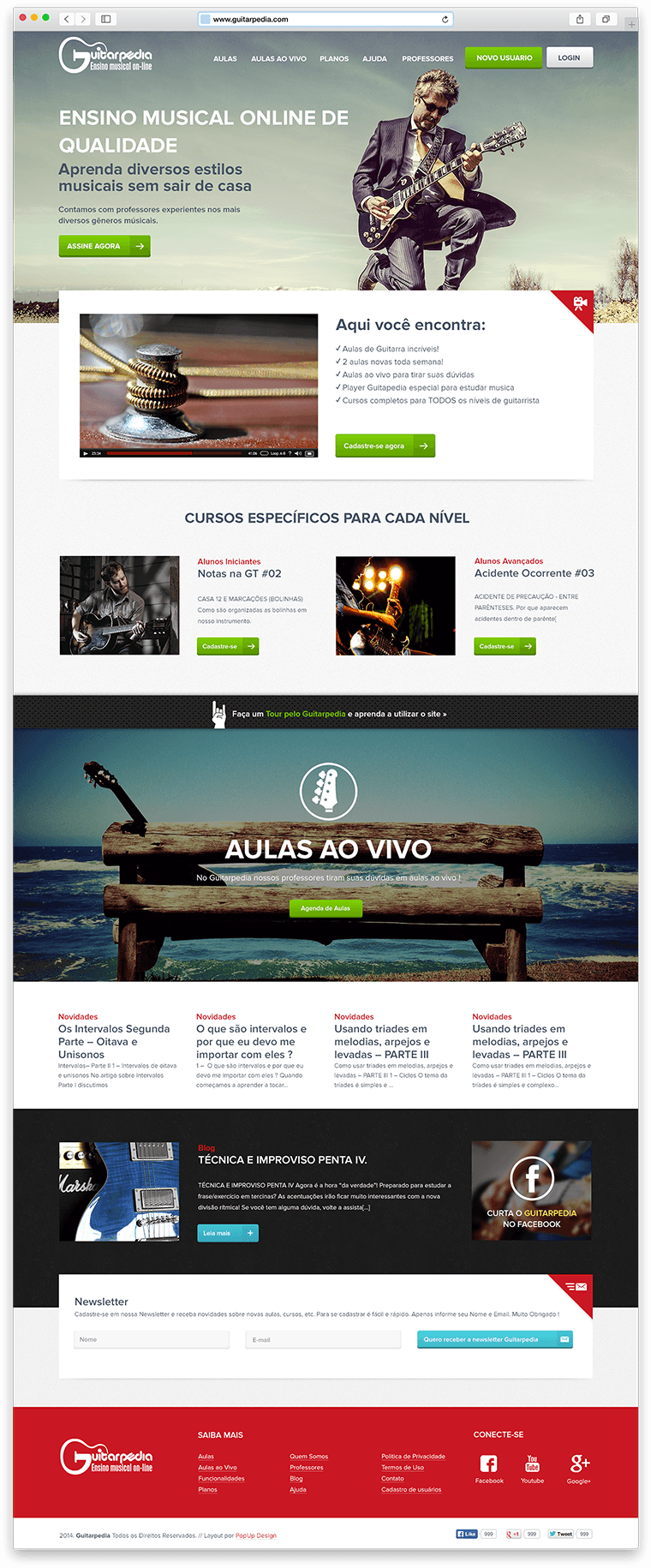
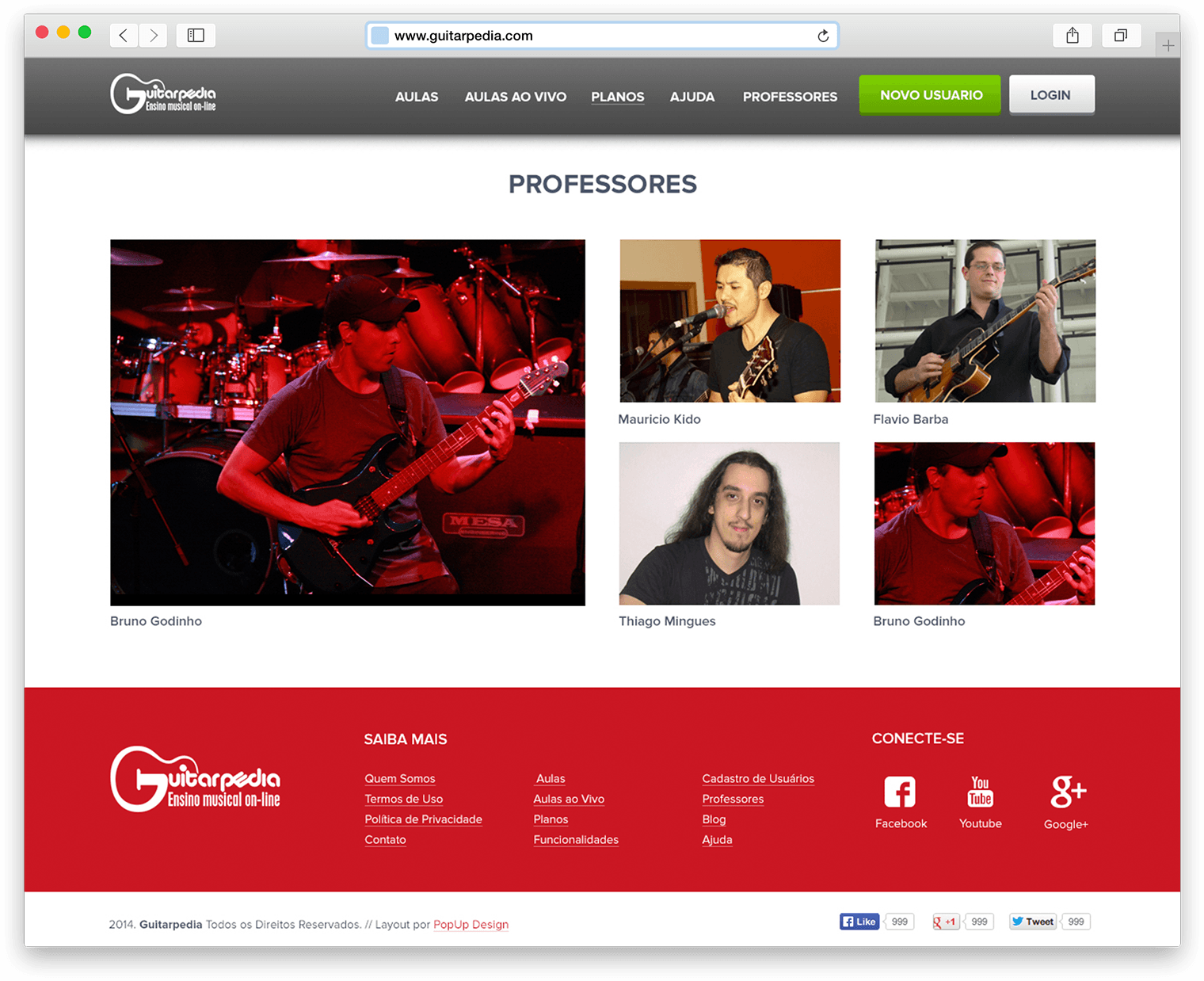
The challenge was bringing to an online classroom the young and bold rock n’ roll attitude, but still keeping a clean, lightweight, and objective layout. To do this, I used striking images combined with small informative texts and call-to-action buttons to guide the users on their learning journey. The inside pages were designed to make the content accessible and dynamic, helping the user find the correct courses for every skill level.
Here are some examples of the final UI of the project.
