The project
In 2019 I started to work at Klarna, one of Europe's largest banks. I joined the Klarna Checkout Team, and my responsibility is to build solutions for safety and data-protection during the checkout and payment process at Klarna's partners. It is a diverse team of Softwares Engineers, Data Scientists, Project Managers, and Designers, working together to build the smoothest online purchase experience.
The Challenge
Filling a form is boring. The checkout process in e-commerces usually is a bunch of forms that the user should fill with personal data. It is a huge friction point for the user experience. The person is excited about buying new goodies and suddenly have to enter in a stressful process that asks for a lot of sensitive data.
Wrong data at this point is bad for everyone: for the user, it means a package lost because the delivery service can't find the correct address. For the merchant, incorrect data is a hidden profit killer because they have to deal with the costs of shipping a package to the wrong place.
The main challenge of working on this product is to guarantee a high quality of data combined with a smooth experience for the customer, and increasing the sales of the merchants' e-commerces.
Automate what is possible, but keep the user informed
One smart way to deal with the stress of filling long forms is to automate this experience and ask for users to interact with the information as little as possible. Automation at this point will help users to finish this task with velocity without making mistakes when they are typing.
High-quality data from several sources helps the team to validate the user's information and identify incorrect data.
Autocomplete
I designed autocomplete solutions for almost all fields in the form. So, when the user needs to fill some form, Klarna Checkout helps them to do this faster and with no typos.
To develop the autocomplete solutions for the forms, I started with some usability research. The goal was to create one solution that does not disturb the user that is typing and, at the same time, helps confused people to fill the form correctly.
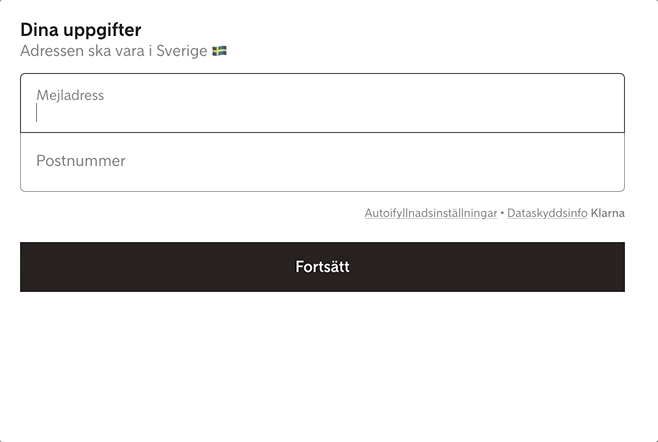
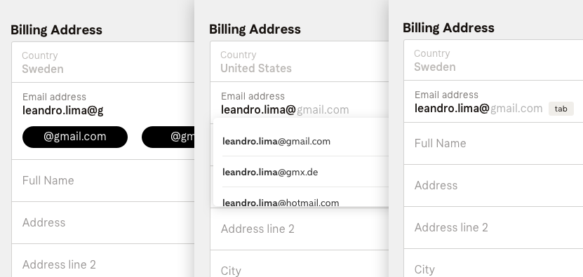
Two fields were especially important: the email field and the country field. The email is the primary contact point between e-commerces and customers. The country field guarantee that the product will be shipped to the right place.
In the email one, I tested some subtle email suggestions. Usability Testings helped the team to make sure that we were helping the users and not disrupting their experience.
After that, I used quantitative data to validate the solution in a real environment and learn about the impact of this new interaction. The main goal was to reduce the number of people typing emails that do not exist and also help users to finalize this task faster.
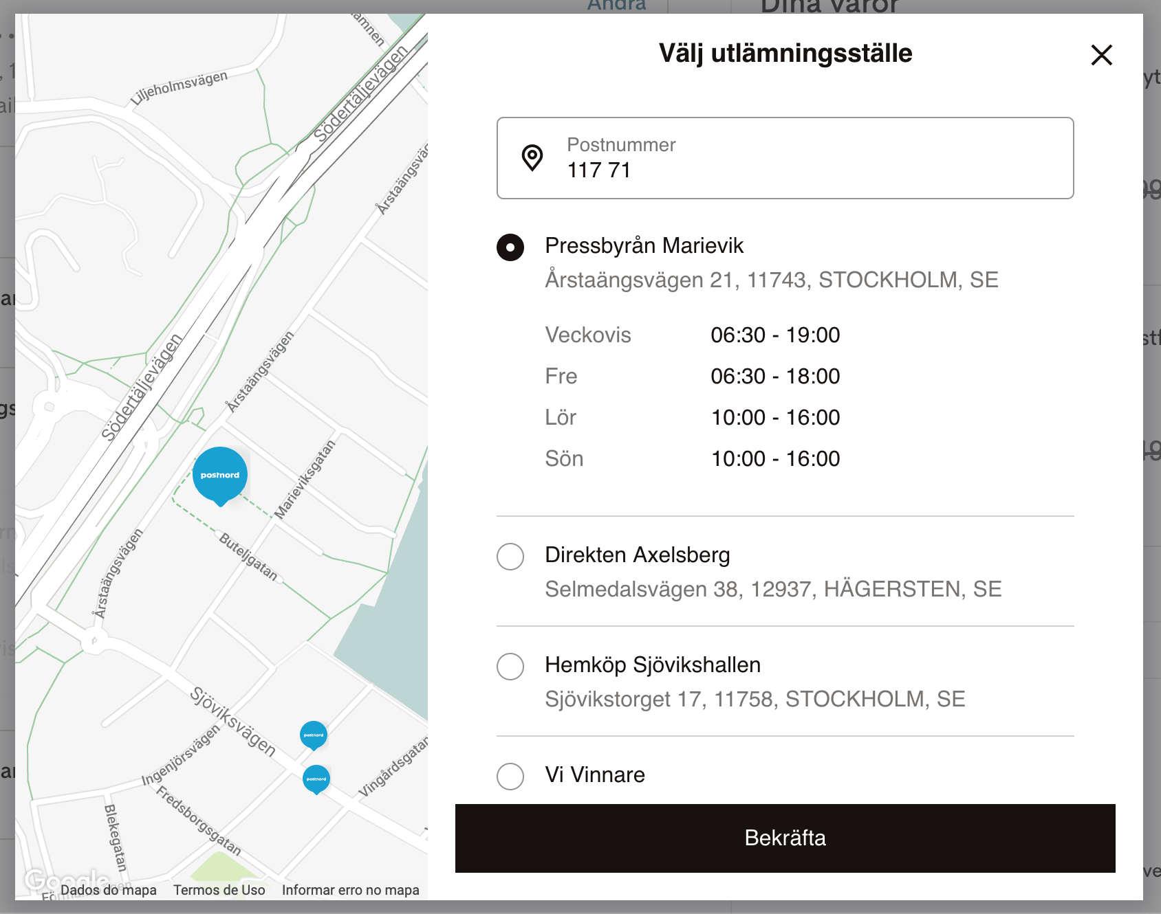
The country selector was designed to help people to find a particular country in a list that includes all the countries in the world. One thing that I took into account to design this was users that type the country name in a different language. For example, Germany has a different name in German (Deutschland) and Portuguese (Alemanha). To help users in this scenario, I used the flags as a way to identify the country, combined with a validation that does not exclude translations of countries' names. It was a collaborative work with the engineers.
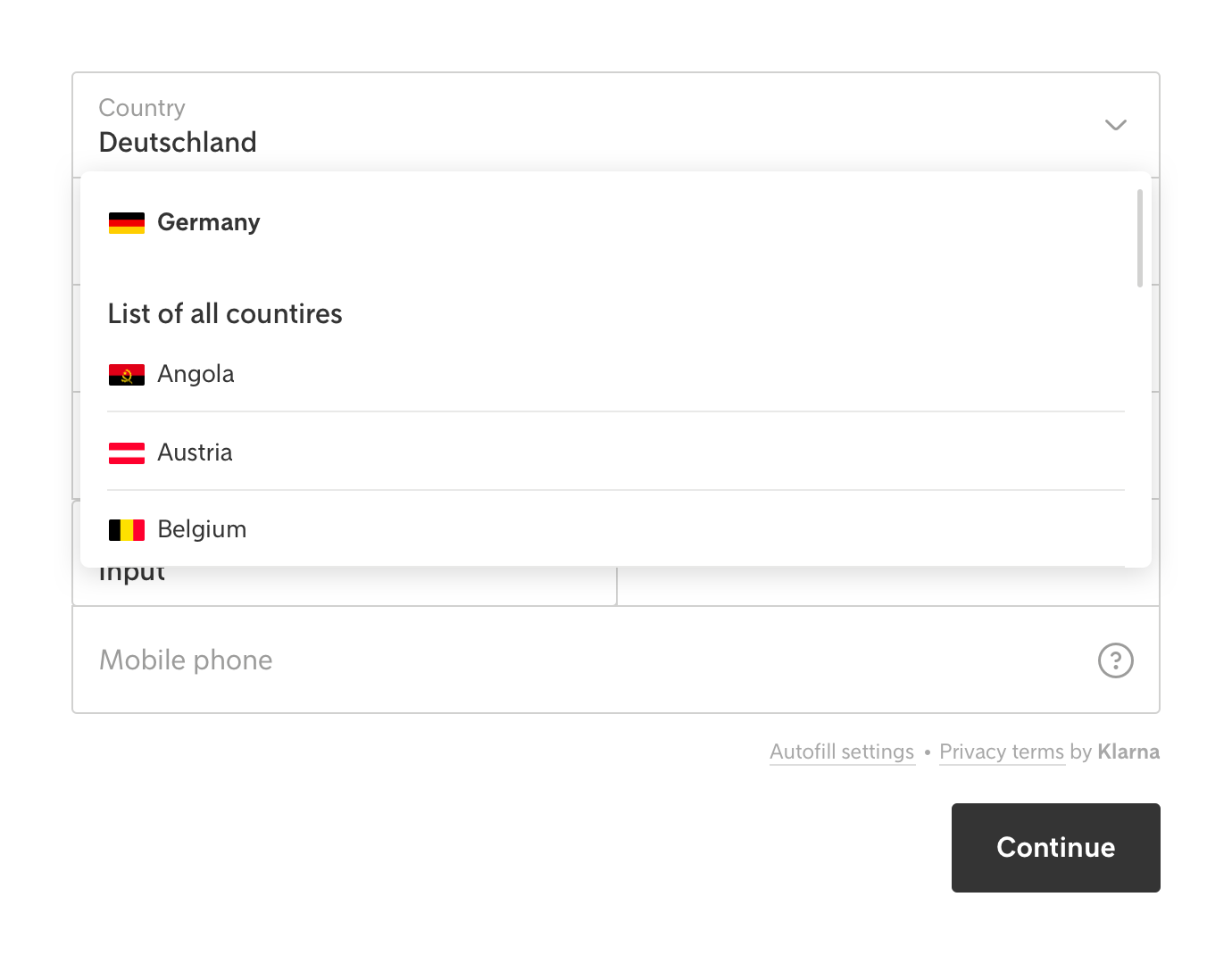
The validation of the country selector was done through tests where we observed the average time that customers take to finish some tasks and the number of mistakes selecting the right country.
Friction is not always a bad thing
It seems a contradiction in UX's good practices. But, sometimes, I had to add extra friction to help the users.
These frictions were there to make sure that the user is double-checking their information and fixing possible mistakes.
Every time that we suspect that something is wrong with the user's address information, we inform them about that in a subtle but perceivable way. So the user can recognize and fix mistakes. It seems like extra friction in the purchasing flow, but we managed to do this in a way that does not lead to frustration. To know that the delivery will find the correct address is a relief to the customer.
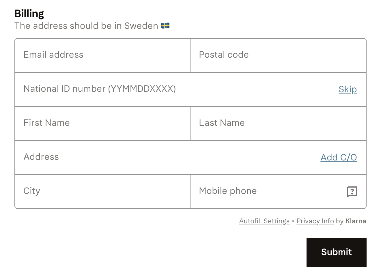
Finding the perfect order for the fields
What is the user's mental model when we ask about their address? To figure this out, I worked together with the research team, and we did card sorting exercise with a mix of customers and non-customers. This research helped me to understand how people organize address information and how they expect to fill billing and shipping forms.
I also had to deal with some technical requirements. Some fields need to be in a specific position. Otherwise, data validation can't work properly.
With the card sorting learnings, I could remove bad ideas. I ended up with a couple of designs that could resonate with our customers' expectations and technical constraints. To decide between all the different ways to organize the form, I did one multivariate testing and chose the one that increases the data quality and the velocity of filling the form.
Results
The results in one of the largest retailers in Norther Europe was stunning
- The number of users who corrected the wrong information during the checkout increased by 168%
- The number of orders with incorrect address went from 8,2% to 2%
- No negative effect on the conversion
In a practical way, we helped the online commerces to increase their profits because they don't have to deal with bad data. Also, we avoid frustration on the customer side because the delivery company will have the correct address to ship the product.